Technosoft Solution

Web Development

Project Information

BC Dairy
British Columbia’s
Website Development
2024

Web Development

About the Project

BC Dairy is a not-for-profit association representing British Columbia’s dairy farmers, showcasing the pride farmers feel in providing for their community, promoting the values they share with consumers, and highlighting how they’re taking care of BC for future generations.

The objective:

  • Ensure accessible information architecture for easy content discovery by several unique audiences.
  • Align visual elements and storytelling with refreshed branding while improving user navigation.
  • Build out powerful farm tour locator functionality filtered by user location.
  • Improve organic SEO search results and boost overall conversion.
  • Implement a fully responsive solution backed by WordPress CMS.

Services:

  • Custom WordPress
  • User Experience Design
  • Web Design
  • Web Hosting & Maintenance
  • SEO Consulting
  • Digital Strategy

PHASE 1

Prototyping

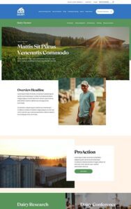
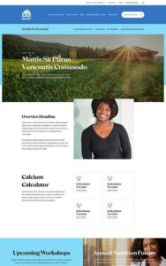
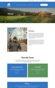
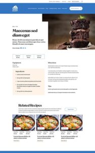
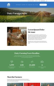
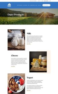
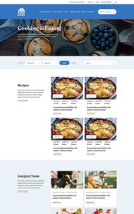
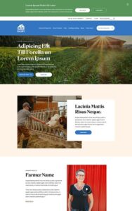
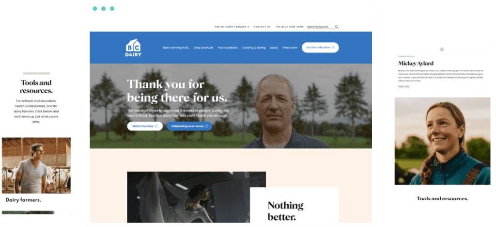
The previous BC Dairy website was stretched thin with mounds of unorganized content, making it hard for visitors to find clear pathways to content. They came to us for help improving their structure and navigation, while addressing a major rebrand with a fresh design.

This web design project was driven by a combination of serious content strategy and fun design. The content needed better filtering for four separate audiences, and the design needed to help those audiences further focus in on areas designed for their unique needs.

PHASE 2

Style

Photos of BC farmers with smiling faces beam out from blue components that evoke clear skies, while softened greens provide a grounded feeling area for statistics and important facts to land. Not to be outdone, the new recipes section features mouth-watering images of the many ways to make delicious use of BC Dairy products.

PHASE 3

Bringing it All Together

The new BC Dairy site uses a tiered main menu and a strong footer menu to distinguish pathways for each audience. Blue elements provide a friendly, open feel to the general public areas, while relevant icons nested in a header pop-out menu steer health professionals and educators to specific, deeper content. Previously scattered blog material is intentionally displayed on audience-specific category landing pages, with their bulky FAQ content now neatly housed in accordion-style slide-outs.

Prev
Next
Drag
Map
Select the fields to be shown. Others will be hidden. Drag and drop to rearrange the order.
  • Image
  • SKU
  • Rating
  • Price
  • Stock
  • Availability
  • Add to cart
  • Description
  • Content
  • Weight
  • Dimensions
  • Additional information
Click outside to hide the comparison bar
Compare